Table of Contents
ToggleA fireplace might be the focal point of a room, but the wrong paint color can make it disappear, or worse, clash with everything around it. Whether dealing with outdated brick, chipped masonry, or builder-grade tile surrounds, a fresh coat of paint offers one of the fastest, most affordable ways to update the look without demo or major construction. The right color choice doesn’t just refresh the fireplace itself: it shifts the entire room’s tone, making spaces feel larger, cozier, or more dramatic depending on the palette. This guide covers practical color options for every style, plus surface prep and paint selection tips to ensure the finish lasts.
Key Takeaways
- Fireplace paint color directly impacts perceived room size and light—lighter tones make spaces feel open while darker shades create depth and drama.
- Popular fireplace paint color ideas range from versatile whites and neutrals for minimalist styles to bold blacks, navy, and deep greens for modern or contemporary designs.
- Proper surface preparation, including cleaning with TSP, repairing damage, and using stain-blocking primer on brick, is essential to ensure paint lasts without flaking.
- Test paint samples directly on the fireplace surround for at least 24 hours and view in multiple lighting conditions, as colors shift differently on brick, stone, and tile compared to drywall.
- For active fireplaces, use high-heat rated paint (1200°F minimum) within 6 inches of the firebox, while surrounding areas can use standard 100% acrylic latex paint in matte, eggshell, or satin sheens.
- Plan for two to three coats of paint and allow proper drying time between applications—skipping priming steps or attempting single-coat coverage on brick leads to failed finishes and repainting.
Why Paint Color Matters for Your Fireplace
A fireplace occupies vertical real estate in a room, often floor to ceiling, and draws the eye whether it’s lit or not. That makes color choice critical. A poorly chosen hue can throw off a room’s balance, shrink the space visually, or create jarring contrast with furnishings and trim.
Paint color affects perceived room size and light. Lighter tones reflect ambient and natural light, making smaller rooms feel more open. Darker shades absorb light and create depth, which works well in larger spaces or when aiming for a dramatic accent wall effect.
The fireplace surround material also influences color performance. Brick holds texture even under paint, so glossy finishes highlight every bump and mortar line. Smooth drywall or tile surrounds show color more uniformly. Existing undertones in brick, reds, oranges, yellows, can bleed through lighter paints if not properly primed, shifting the final appearance.
Finally, paint color sets the fireplace’s role in the room. Neutral tones let it recede into the background, allowing furniture and art to take focus. Bold colors make it the statement piece. Understanding that relationship upfront saves repaints and regret.
Classic White and Neutral Fireplace Paint Colors
White remains the most popular fireplace paint choice for good reason: it’s versatile, brightens spaces, and works with nearly any decor style. Pure white (such as untinted bases or colors with LRV, Light Reflectance Value, above 85) delivers a crisp, modern look that pairs well with Scandinavian, coastal, or minimalist interiors.
Off-whites and warm whites introduce subtle warmth without the starkness. Colors with slight cream, beige, or gray undertones soften the contrast against wood floors or warm-toned furniture. These shades work especially well in rooms with limited natural light, where pure white can read as cold or institutional.
Greige (gray-beige hybrids) has gained traction as a middle-ground neutral. It offers more character than plain beige while staying subtle enough not to compete with bolder accents in the room. Greige works particularly well when the fireplace surround is brick or stone, as it complements natural material tones without clashing.
Light gray provides a cooler alternative to white. It adds dimension and pairs cleanly with contemporary furniture, stainless steel accents, and black window frames. Lighter grays (LRV 60–75) keep the fireplace from feeling heavy, especially when the mantel and trim are painted to match.
Neutrals don’t require bold decor to succeed, but they do benefit from texture, consider leaving the mantel wood-toned or adding a contrasting tile hearth to prevent the fireplace from blending into the wall entirely.
Bold and Dramatic Fireplace Color Choices
Bold fireplace colors turn the surround into an intentional design statement. They work best in rooms with enough square footage to handle a strong focal point, or in open-plan spaces where the fireplace anchors one zone.
Black is the go-to for modern, industrial, and transitional styles. It creates sharp contrast against white walls and highlights architectural details like corbels, arches, or raised panel mantels. Matte black hides surface imperfections better than satin or semi-gloss, which can emphasize texture inconsistencies in brick or rough masonry. Black also pairs well with brass or gold fireplace doors and toolsets, creating a high-end look without added cost.
Navy blue offers drama with slightly more warmth than black. It works particularly well in traditional or cottage-style homes and pairs cleanly with white trim, natural wood, and leather furniture. Many interior design trends in 2026 lean into jewel tones, making navy a practical choice for homeowners wanting a current look that won’t feel dated in three years.
Charcoal gray splits the difference, darker than medium gray but not as stark as black. It adds depth without the commitment of pure black and works in both modern and rustic settings. Charcoal reads well with stainless steel inserts and concrete hearths.
Deep green (forest, hunter, or emerald tones) is gaining popularity in 2026, especially in spaces with natural wood accents or plants. It brings an organic, grounded feel and pairs well with warm metals like copper or aged brass.
Before committing to a bold color, test a sample board (at least 2′ x 2′) painted and propped against the fireplace for a few days. View it in morning, afternoon, and evening light to see how the color shifts.
Earthy and Warm Tones for Cozy Fireplaces
Warm, earthy tones suit fireplaces meant to anchor cozy, lived-in spaces. These colors work especially well in family rooms, dens, and basements where comfort takes priority over minimalism.
Soft beige and tan shades add warmth without heaviness. They complement wood mantels, stone hearths, and traditional furniture. Beige works particularly well when the fireplace brick has warm red or orange undertones, as it harmonizes rather than fights the base color.
Terracotta and clay tones bring an organic, Southwestern or Mediterranean vibe. These colors work well in homes with exposed wood beams, saltillo tile floors, or rustic decor. On brick fireplaces, terracotta-based paints can unify mismatched mortar lines and create a cohesive, intentional look.
Warm taupe sits between beige and gray, offering neutrality with a hint of warmth. It’s a safe choice for homeowners hesitant to commit to pure gray or beige and pairs well with both cool and warm accent colors.
Muted sage green adds subtle color while maintaining an earthy, natural feel. It works in farmhouse, cottage, and transitional styles, especially when paired with white trim and natural fiber rugs. Sage reads as a neutral in many lighting conditions, making it more versatile than bold greens.
When selecting earthy tones, consider the room’s existing wood finishes. Warm paint colors can clash with cool-toned gray or weathered wood, while they complement honey oak, walnut, and cherry beautifully. Sample boards again, critical for warm tones, which can shift dramatically under different light sources.
How to Choose the Right Paint Color for Your Fireplace
Start by assessing the fireplace’s relationship to the room. If it’s centered on a wall with symmetrical built-ins or flanking windows, it’s already a focal point, paint color can either emphasize or downplay that. If it’s off-center or competes with other architectural features, a neutral or room-matching color helps it blend.
Consider the room’s existing palette. If walls, furniture, and trim are neutral, the fireplace offers an opportunity for color. If the room already has bold hues or patterns, a neutral fireplace prevents visual overload. Many successful paint color guides recommend anchoring a room with one main color and two or three supporting tones, decide where the fireplace fits in that hierarchy.
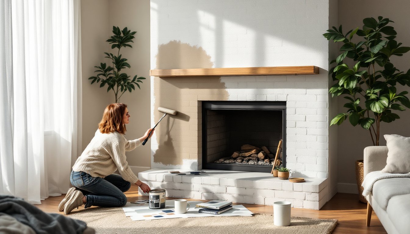
Test paint samples on the actual fireplace surface, not just sample boards. Brick, stone, and tile all absorb and reflect paint differently than drywall. Paint a section at least 12″ x 12″ and let it dry fully (24 hours minimum) before judging. Colors often dry darker than they appear wet, especially on porous surfaces like brick.
Factor in the room’s natural light. North-facing rooms receive cooler, bluer light, which can make warm paint colors look muddy. South-facing rooms get warm, golden light that enhances warm tones but can make cool colors look washed out. East- and west-facing rooms shift throughout the day, test samples at multiple times.
Think about the fireplace’s finish and the room’s style. High-gloss paint works in modern spaces but looks out of place in rustic or traditional settings. Matte and flat finishes suit most styles but show soot and fingerprints more easily. Eggshell or satin finishes offer a middle ground, cleanable but not shiny.
Finally, consider longevity and flexibility. Neutrals allow for easier decor changes over time. Bold colors make a statement but may require repainting if tastes shift or when selling the home.
Best Paint Types and Preparation Tips for Fireplace Projects
Not all paints handle fireplace conditions equally. Standard latex wall paint works for non-functional or decorative fireplaces and surrounds that don’t experience heat. For active fireplaces, the surround and mantel can use standard paint, but anything within 6 inches of the firebox opening should use high-heat paint rated to at least 1200°F. This applies to the firebox interior, which should be painted with stove paint or left as bare firebrick.
For brick, stone, or masonry surrounds, use 100% acrylic latex paint in a matte, eggshell, or satin sheen. Acrylic formulas breathe better than oil-based paints, allowing moisture to escape and reducing the risk of peeling. Flat paint hides texture but is harder to clean: satin allows for spot-cleaning without sheen variations.
Surface prep determines paint longevity. Skip it, and paint will flake within a year.
-
Clean thoroughly. Remove soot, grease, and smoke residue with TSP (trisodium phosphate) or a TSP substitute mixed per label instructions. Scrub with a stiff nylon brush, rinse with clean water, and let dry completely, 24 to 48 hours for porous brick.
-
Repair damage. Fill cracks in mortar or masonry with mortar repair caulk or fireplace repair compound. Sand rough spots on drywall or wood surrounds with 120-grit sandpaper.
-
Prime appropriately. Brick, especially red or orange brick, requires a stain-blocking masonry primer to prevent tannin bleed-through. One coat is usually sufficient, but heavily stained or smoke-damaged brick may need two. For previously painted surfaces in good condition, a bonding primer ensures adhesion.
-
Use proper tools. A 3/8-inch nap roller works for smooth surfaces: a 3/4-inch nap handles brick texture better. Cut in around edges and details with a 2-inch angled brush. For heavily textured brick, a paint sprayer (like a handheld HVLP model) can save time, but plan for significant masking and drop cloth coverage.
Safety: Wear safety goggles, nitrile gloves, and an N95 respirator when cleaning with TSP or working in dusty conditions. Ventilate the area well. If the fireplace is gas, turn off the gas supply before painting near the burner or pilot assembly.
Plan for two coats of paint in most cases. Brick and porous stone often need a third coat for even coverage, especially when going from dark to light. Let each coat dry per the manufacturer’s recommendation, usually 2 to 4 hours between coats, with full cure in 7 days.
Avoid paint tutorials that skip the priming step or suggest single-coat coverage on brick. That shortcut leads to callbacks and repaints.
Conclusion
Choosing the right fireplace paint color and applying it correctly transforms the room’s focal point without the cost or complexity of a full remodel. Whether going with classic white, bold black, or earthy terracotta, the key is matching the color to the room’s style, light, and function, and not skipping surface prep. Proper priming and paint selection ensure the finish lasts through years of use and seasonal fires.